
Lead Designer: Exhibit Design
Titanic: Lost and Found
Exhibit redesign to modernize the visitor experience
THE STORY
In 1985, the WHOI played a key role in discovering the wreck of the Titanic, using sonar mapping, remotely operated vehicles (ROVs), and deep-sea submersibles. Their pioneering use of underwater robotics and imaging systems enabled the first visual confirmation of the site, over 12,000 feet deep. This breakthrough not only solved a decades-long mystery but also revolutionized deep-sea exploration and oceanographic research.
MY ROLE
Redesigning Titanic: Lost and Found was an opportunity to modernize the existing exhibit. I developed a modern visual identity by pairing a high contrast blue-teal gradient with a bold type treatment. The color palette evokes the deep ocean depths while the gradient represents the act of finding something in the dark. Using new brand fonts, I restructured the typographic hierarchy by specifying the heading, subheading, and body text. We also crafted a clear narrative that guides visitors through the Titanic’s journey, discovery, and future impacts. The result is a refined exhibit that presents the Titanic's story in a way that feels fresh and focused.

THE OLD EXHIBIT
The client noted that the previous design felt outdated. Text-heavy panels, inconsistent typography, and a lighter color palette make the space feel crowded and harder to navigate. The layout offers limited pacing or contrast which can impact how visitors take in the information. Overall, the design prioritizes content over user experience, making the exhibit feel static and visually overwhelming.

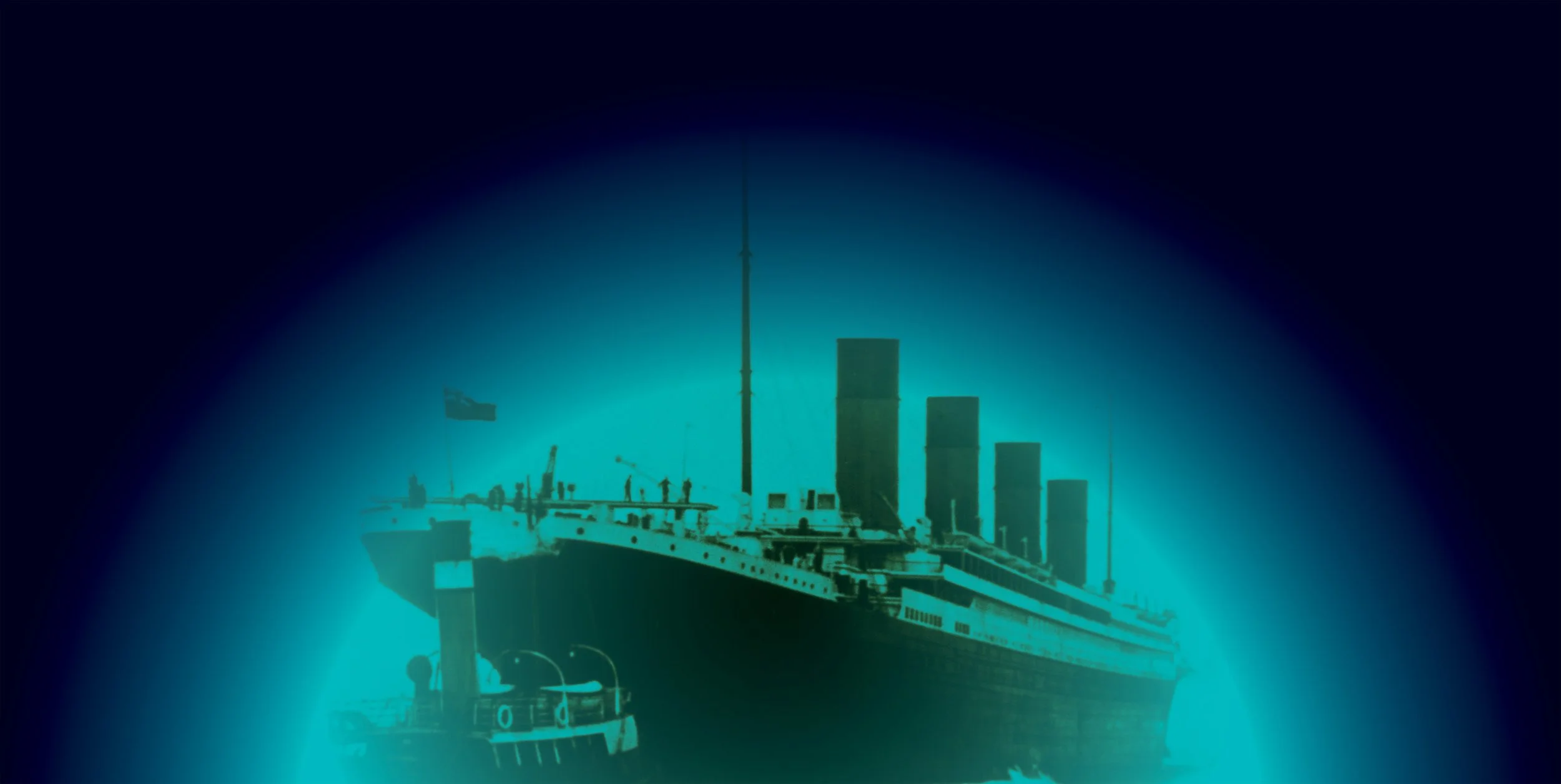
THE REDESIGN
The redesigned Wall 1 of Titanic Lost and Found offers a cleaner, more immersive visitor experience through strong visual hierarchy and clearly structured typography. The use of a large, dramatic image of the Titanic creates an immediate focal point. The gradient background—shifting from deep navy to sea green—evokes the ocean’s depth, while also improving text contrast and guiding the eye laterally across the wall.

These exhibit panels extend the visual identity created for the redesigned exhibit. The modern, high-contrast typography and bold text treatments ensure clarity and guide the viewer through historical and technical content. The panels use large, impactful images to complement the text, while the gradient enhances the immersive experience.
See below for all the panels.
